【Python数据分析案例】(九)——PCA-K均值-轮廓系数客户聚类
时间:2023-11-21 访问量:1513
导读
本案例适合应用统计,数据科学,电商专业
K均值对客户进行分类的案例都做烂了......但我认为这个案例还是有一定的价值的,使用了pca,还有轮廓系数寻找最优的聚类个数。
下面来看看
代码准备
导入包
import numpy as np
import pandas as pd
import matplotlib.pyplot as plt
import seaborn as sns

pd.set_option('display.max_columns', None)
读取客户的特征数据,就是每个客户买不同种类的商品的消费金融
category_spends = pd.read_csv("category_spends_sample.csv")
category_spends.fillna(0, inplace=True)
print(category_spends.shape)
category_spends.head()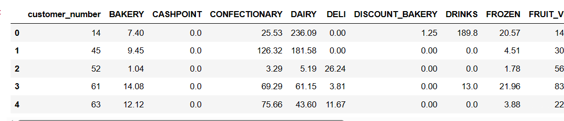
可以看到总共有3000个客户,
下面把这3000客户的消费记录都读取进来
baskets_sample = pd.read_csv("baskets_sample.csv")
baskets_sample.fillna(0, inplace=True)
print(baskets_sample.shape)
baskets_sample.head()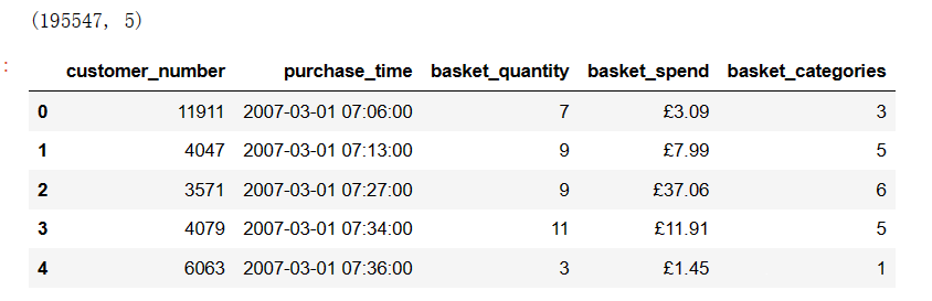
可以看到这3000个客户有19w的消费记录。
查看一下是不是3000个客户
baskets_sample['customer_number'].unique().shape
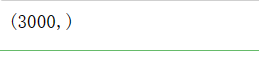
没问题。
然后我们需要构建一个特征,表示客户的最近一次消费的时间,就是FRM模型里面的R,
recent =baskets_sample.groupby('customer_number').agg({'purchase_time': 'max'})
recent['purchase_time']= pd.to_datetime(recent['purchase_time'])
recent.head()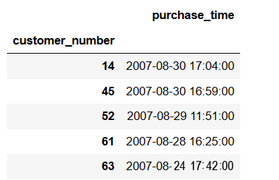
然后处理一下
recent=recent.assign(recency=pd.to_datetime('2007-08-31 21:55:00')-recent['purchase_time'])
recent = recent.reset_index()[['customer_number','recency']]
recent['recency']=recent['recency']/pd.Timedelta(days=1)    #变成天
recent = recent.drop_duplicates()
recent.head()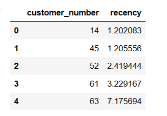
这样客户就多了Recency这个特征,然后再读取一个顾客消费金融的数据集
customers_sample = pd.read_csv('customers_sample.csv')
customers_sample.fillna(0, inplace=True)
print(customers_sample.shape)
customers_sample.head()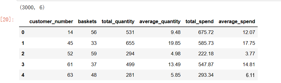
就是每个客户的一些特征。
总之上面的事情都是在提取客户的特征。把这些特征进行合并
data =pd.merge(category_spends, customers_sample, on='customer_number')
data=pd.merge(data, recent, on='customer_number')
customer_ID=data['customer_number']
data.drop(['customer_number'], axis = 1, inplace = True)
data.head()
然后下面对这些特征进行可视化

可视化图
data.hist(grid=False,figsize =(16,10))
plt.tight_layout()
plt.show()

相关性热力图
plt.figure(figsize=(18,18),dpi=128)
sns.heatmap(data.corr(), cmap="Oranges",annot=True)
plt.xticks(range(len(data.columns)), data.columns);
plt.yticks(range(len(data.columns)), data.columns);
plt.show()

删除一些不用的特征
data.drop(['average_spend','average_quantity','total_quantity'], axis = 1, inplace = True)
直方图
logged_data = np.log(data+1)
logged_data.columns = data.columns
logged_data.hist(grid=False, figsize=(15,13))
plt.show()

PCA主成分
进行pca降维
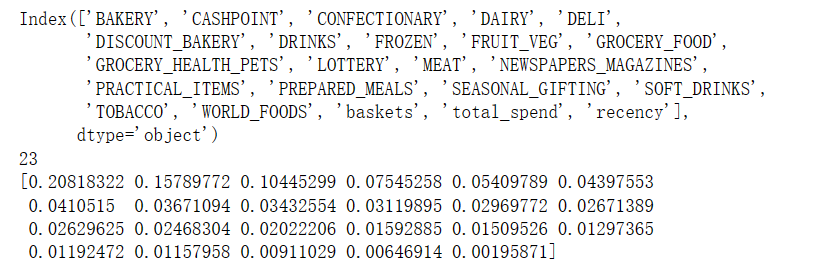
from sklearn.decomposition import PCA
pca = PCA()
pca.fit(logged_data)
print(data.columns)
print(len(data.columns))
print(pca.explained_variance_ratio_)
plt.plot(pca.explained_variance_ratio_.cumsum(), 'o-')
plt.xlabel('Principal Component')
plt.ylabel('Cumulative Proportion of Variance Explained')
plt.axvline(8, color='k', linestyle='--', linewidth=1)
plt.title('Cumulative PVE')
可以看到大概9个主成分就到了进80%的解释能力
拟合9个主成分,画图,表示每个主成分和原来的x的关系
#-- Generate a PCA factorization of your data
pca = PCA(n_components= 9)
pca.fit(logged_data)
#-- import a helpful set of functions to ease displaying results..
import renders as rs
#-- Generate a PCA results plot
pca_results = rs.pca_results(data, pca)
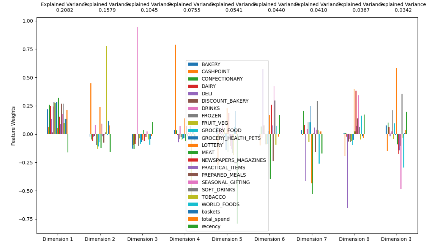
这个图可以清楚的看到每个主成分是员原来的X的如何的线性组合。
拟合
from sklearn.decomposition import PCA

pca = PCA(n_components=9)
pca.fit(logged_data)
print(data.columns)
print(pca.components_)
计算轮廓系数,寻找最佳的聚类个数
from sklearn.cluster import KMeans
from sklearn.metrics import silhouette_score

# Create range of clusters
range_n_clusters = list(range(5,8))
print(range_n_clusters)
range_score = []
# Loop through clusters
for n_clusters in range_n_clusters:
    # TODO: Apply your clustering algorithm of choice to the reduced data
    clusterer = KMeans(n_clusters=n_clusters).fit(reduced_data)

    # TODO: Predict the cluster for each data point
    preds = clusterer.predict(reduced_data)

    # TODO: Find the cluster centers
    centers = clusterer.cluster_centers_

    # TODO: Calculate the mean silhouette coefficient for the number of clusters chosen
    score = silhouette_score(reduced_data, preds, metric='euclidean')
    range_score.append(score)
    print("For n_clusters = {}. The average silhouette_score is : {})".format(n_clusters, score))
plt.plot(range_n_clusters, range_score)
plt.show()
聚类个数为6的时候最大,我们选择聚类6个。
把聚类结果画图上
clusterer = KMeans(n_clusters=6).fit(reduced_data)
preds = clusterer.predict(reduced_data)
centres = clusterer.cluster_centers_
#-- Put the predictions into a pandas dataframe format
assignments = pd.DataFrame(preds, columns = ['Cluster'])

#-- Put the predictions into a pandas dataframe format
plot_data = pd.concat([assignments, reduced_data], axis = 1)

#-- Color the points based on assigned cluster (n.b scatter will do this for us automatically)
plt.rcParams['figure.figsize'] = (14.0, 8.0)

for i, c in plot_data.groupby('Cluster'):
    plt.scatter(c[0], c[1])

#-- Plot where the cluster centers are
for i, c in enumerate(centres):
    plt.scatter(x = c[0], y = c[1], color = 'white', edgecolors = 'black', marker = 'o', s=300);
    plt.scatter(x = c[0], y = c[1], marker='${}$'.format(i), alpha = 1, s=50);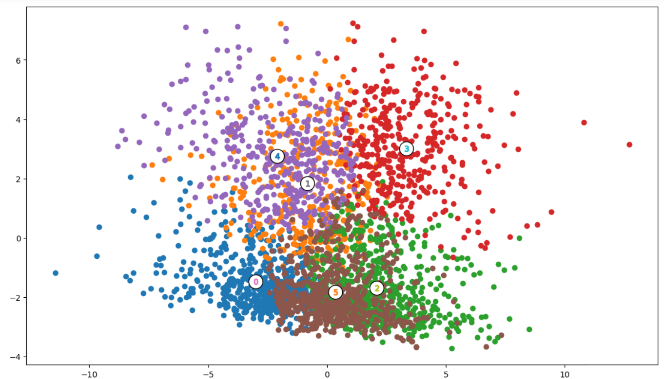
查看聚类中心
# TODO: Inverse transform the centres
log_centres = pca.inverse_transform(centres)

# TODO: Exponentiate the centres
true_centres = np.exp(log_centres)

#-- Display the true centres
segments = ['Segment {}'.format(i) for i in range(0, len(centres))]
true_centres = pd.DataFrame(np.round(true_centres), columns = data.columns)
true_centres.index = segments
true_centres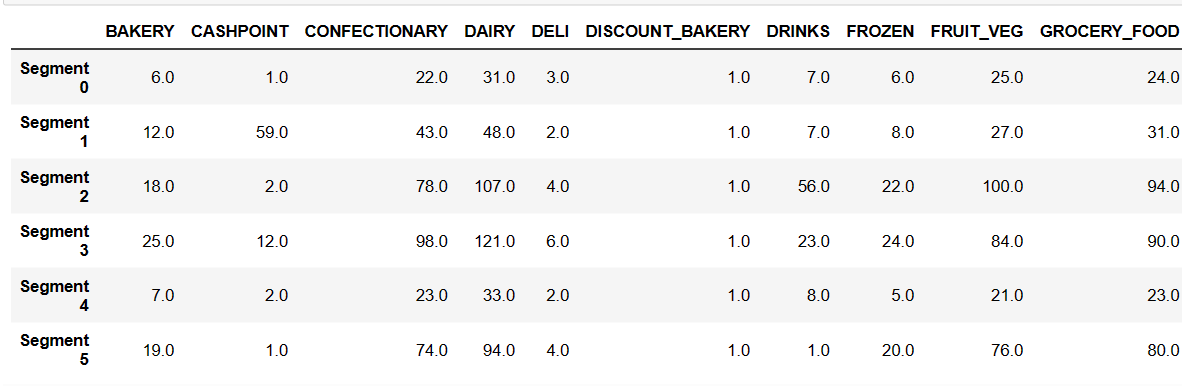
合并聚类的结果
final_assigments = pd.concat([customer_ID,assignments, data], axis = 1)
#final_assigments['customer_number']=customer_ID
final_assigments

储存:
final_assigments.to_csv('result.csv',index=False)这样每个客户属于哪一类都打上了标签,他们的特征也都跟在后面了
 售前咨询专员
